
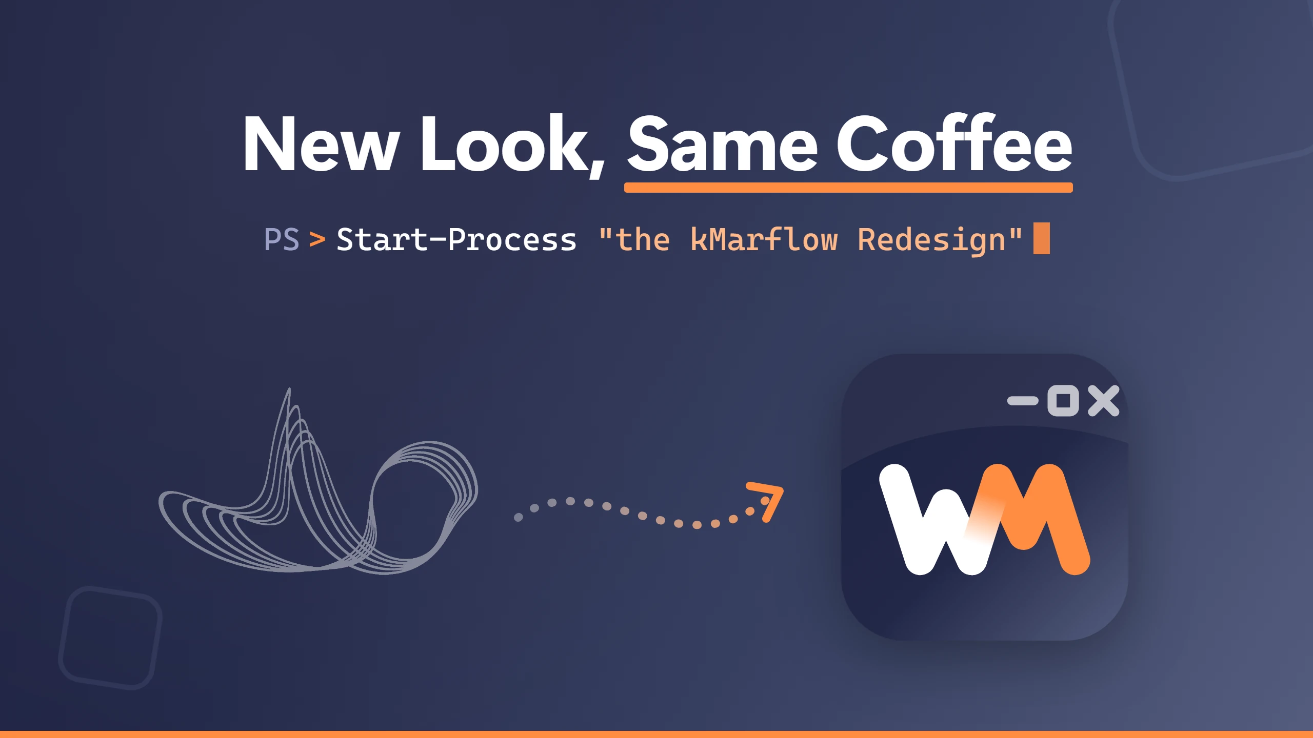
If you’ve been here before, you’ve probably noticed: things look different. The kMarflow redesign brought a new logo in the header, a new banner on the home page, a whole new theme around them, and a browser tab icon that no longer looks like a squiggle. (If you’re new here: hi! You picked a good moment.)
This post isn’t about fixing Windows or writing PowerShell. Well, mostly not. It’s about where the old look came from, why it had to go, and how the name I’ve been using for years turned out to have its own logo hidden inside it. So grab a coffee, and let’s turn things around.
The old wave: from the DJ booth to the blog
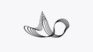
The old wave is actually older than this blog. Several years back I made music and did some DJing, and while fooling around in a 3D program I ended up with this ribbon of thin black lines that swoops up into a peak and curls into a loop. I thought it looked sick, so it became my logo for the music. When I started this blog in January 2025, I simply took it along.
And I still like it. But it belongs to a different chapter. It was the logo of my music days, not of someone who writes 20-minute articles about the Registry. Nothing in it said Windows, and nothing said IT. The longer it sat next to the blog’s name, the less it felt like me.
It also had a very practical problem, the kind I really should have spotted sooner: thin black hairlines on a transparent background. Shrink that down to 16 pixels for a browser tab and it turns into a grey smudge. Put it on a dark tab bar and it’s gone completely. A logo that disappears in dark mode, on a Windows blog. Not great.
And the banner on the home page? A stock image of a laptop with a glowing network of lines and dots. You’ve seen it before, probably on a hundred other tech blogs. So had I, and that’s exactly the problem.
A blog called WinIT
This blog started out as “kMarflow | IT-Blog”. Today it’s the WinIT-Blog, and that name does two jobs at once.
Win IT as in Windows IT, obviously. That’s what this place is about.
But also win it, as in winning. Every repaired system file, every script that runs on the first try, every annoying problem that finally just works: that’s a small win. This blog is about collecting them, and helping you collect yours.
The wave said none of that. It didn’t say Windows, and it certainly didn’t say winning. It just… waved.
And then came Marflow Software
This summer, version 1 of TextTemplateManager shipped. Then, this October, version 2 landed in the Microsoft Store, and with it came software.kmarflow.com: the home of Marflow Software, with TextTemplateManager, TTM Connect and my PowerShell-Tools.
That site needed a logo too, and at first it simply borrowed the TextTemplateManager app icon. Which works fine, until you think about it for more than a minute: an app icon is not a brand. What happens when the next app shows up? Do they take turns?
So now I had two places. The blog is the knowledge side: explaining, fixing, the “how does this actually work”. The software is the tool side: the things I build when the existing ones fall short. Marflow is the umbrella over both, and it needed one mark for both, with the name next to it telling you which side you’re on.
Wolfram, backwards
The wave wasn’t the only thing I brought along from my music days. The name came from there too.
Here’s something not everyone knows: my legal name is Wolfram Halatschek. And kMarflow isn’t some random handle. Read “Wolfram” backwards:
W-o-l-f-r-a-m → m-a-r-f-l-o-W
Marflow. That was supposed to be my artist name. Weirdly enough, not far from me, in another city, there already was a DJ calling himself Marflow. (He changed his name some years ago.) I needed a name that was unique, and I wanted a domain to go with it.
So a k went in front. You could read all sorts of things into it: k for a thousand, k as in “very much”, whatever you like. But no. It’s simply the last letter of my last name, Halatschek. And kMarflow it was.
This being a PowerShell blog, of course I have to prove it:
$first    = 'Wolfram'
$last     = 'Halatschek'
$reversed = -join $first[-1..-$first.Length]    # marfloW
$brand    = (Get-Culture).TextInfo.ToTitleCase($reversed.ToLower())
"$($last[-1])$brand" # kMarflowNow look at the first letters. Wolfram starts with a W. Marflow starts with an M. And what do you get when you turn a W upside down? An M.
My name had a logo in it the whole time. Turn it around, and it flips.
That’s the core of the new icon: a W that flips into an M, read from left to right, just like the name turning around. The W is me: Wolfram (and conveniently also Windows, and WinIT). The M is Marflow, so the M gets the orange.
Where the flow comes in
The flip alone wasn’t enough, though. A W next to an M is just two letters standing side by side. Turning around is one half of the name; the other half is flow.
So I looked closer at the strokes. The last stroke of the W runs from bottom left to top right. So does the first stroke of the M. Same direction, same angle. So why draw it twice?
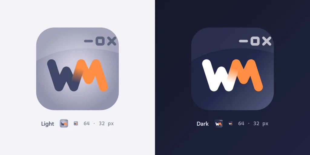
In the final icon, the W and the M share that middle stroke, and it fades from the W’s color into orange as it climbs. WM becomes one continuous zigzag, and you can’t quite tell where Wolfram stops and Marflow starts. That’s kind of the point.
It also describes what I actually do, here and in the software: take something broken or repetitive and turn it around into something that just runs. That’s flow. That’s what good automation feels like.
It’s all about Windows
The mark needed one more hint, something that says “software” and “Windows” without turning into a clip-art collage. So up in the corner of the tile sit three tiny window caption buttons: minimize, maximize, close. You know them; you click them a hundred times a day.
(One earlier version used three little dots instead. It looked like a Mac. On a Windows blog. Next!)
The caption buttons are a nice detail at full size, and they disappear at 16 pixels by design. What stays readable in a browser tab is the part that matters: the flip.
The colors are calm on purpose: slate ink and one single orange accent, no rainbow. The light version sits on a soft lavender tile, the same family as the TextTemplateManager icon. The dark version sits on slate, matching software.kmarflow.com.
How it came together: this or that
I’d love to tell you I sketched this on a napkin in five minutes. The reality: ten sheets of drawn options, and every question on them was a simple “this or that”. Mirror or flip? Window or no window? Lavender or slate? Thin strokes or bold? Each answer narrowed things down a little more, until only one option was left standing.
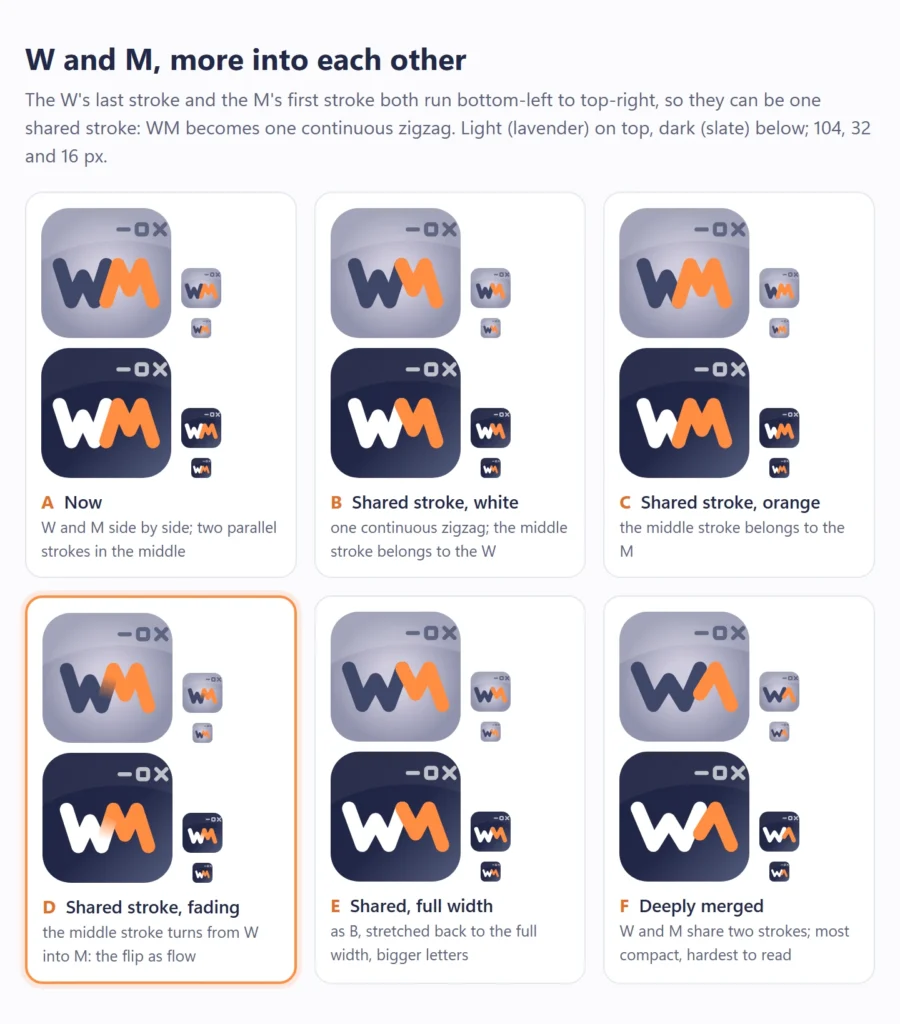
A few honorable mentions that didn’t make it:
- A speech bubble. Looked like a chat app.
- An open book. Trying to say way too much in way too little space.
- A coffee mug. Yes, really. Considering how many of my posts start with “grab a coffee”, it would have been the most honest option. It also looked like the logo of a coffee house.
- An infinity sign, or another wave. Been there, done that.
- An orange tile. It just looked bad. No deeper reason.
The new banner: a PowerShell prompt
The stock laptop on the home page is gone too. The new banner uses the same slate gradient as software.kmarflow.com, so jumping between the blog and the software feels like one place. On it: the flip mark, the WinIT-Blog name, and a PowerShell prompt:
PS > Windows · PowerShell · IT Automation & AppsComplete with an orange cursor at the end. Because if this blog lives anywhere, it’s in a PowerShell window. The “& Apps” is new: with TextTemplateManager and TTM Connect out in the world, the blog now covers my own tools as well, not only scripting.
A WordPress lesson along the way
Not everything went smoothly, and since this is still an IT blog, here’s a tip you can actually use.
After I uploaded the new banner, the text on it looked blurry. Not terrible, just soft. The old stock photo was fuzzy enough that it had hidden this all along.
The culprit was the Resolution setting of the Image block. It was set to Large. With “Large”, WordPress caps the image’s sizes attribute at 1024 pixels, while the block itself was displayed 1280 pixels wide. So the browser did exactly what it was told: it downloaded the 1024-pixel version and stretched it by 1.25×. On a photo you barely notice. On crisp text and sharp lines, you do.
The fix: select the Image block, and in the block settings set Resolution to Full Size. Now sizes matches the real display width, and the browser picks a sharper version from the srcset.
So if the text in your WordPress images ever looks soft, check that setting first.
One more trick: a favicon that knows dark mode
For the nerds among you: on software.kmarflow.com, the favicon is a single SVG file that switches between the light and the dark version on its own. SVG supports CSS, including media queries, so the file carries both versions and simply hides the one that doesn’t fit:
<svg xmlns="http://www.w3.org/2000/svg" viewBox="0 0 64 64">
  <style>
    .dark { display: none; }
    @media (prefers-color-scheme: dark) {
      .light { display: none; }
      .dark  { display: inline; }
    }
  </style>
  <g class="light"><!-- lavender tile, ink W --></g>
  <g class="dark"><!-- slate tile, white W --></g>
</svg>Browsers that support SVG favicons pick the matching version from your system theme, no JavaScript involved. Keep a PNG icon as a fallback for the rest.
The rest of the blog followed
Once the icon and the banner were done, the rest of the blog suddenly looked out of place: the default theme with its beige tones and serif headings didn’t match the ink and orange at all. So I didn’t stop there. The blog now runs on its own theme: a slate header with the same orange line as the banner, Segoe UI and Cascadia Code for the text and code, and a dark mode that simply follows your system settings. Remember the old logo vanishing on dark tab bars? Now the whole blog does dark mode properly.
What’s next
If you missed it: the whole story of TextTemplateManager 2 and its new home on software.kmarflow.com has its own post.
With the new look in place, it’s back to what this blog is about: Windows, PowerShell, and fixing the things that break.
So that’s the story. The wave goes back to the music days where it came from, and the name from those days finally gets a logo of its own: a W that turns into an M, Wolfram flowing into Marflow, with a little bit of Windows in the corner. It took ten sheets of sketches to find something that was in my name all along.
Let me know in the comments what you think. And until next time, keep those servers humming and your scripts flowing.
Cheers,
Wolfram
Leave a Reply